Data
- Data means information. So interpreting data just means working out what the information is telling you.
- Information is sometimes shown in tables, charts and graphs to make the information easier to read. It is important to read all the different parts of the table, chart or graph.
Tables
A table is used to write down a number of pieces of data about different things.
Table example
Table example
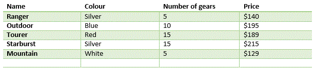
The title of the table tells us what the table is about.
The headings tell us what data is in each column.
To find out the colour of the tourer bike, you look across the Tourer row until it meets the colour column. So a Tourer bike is red!
The headings tell us what data is in each column.
To find out the colour of the tourer bike, you look across the Tourer row until it meets the colour column. So a Tourer bike is red!
Tally marks and frequency tables
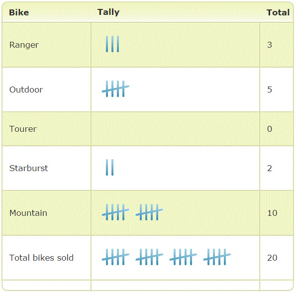
Tally marks are used for counting things. They are small vertical lines (like the number 1) each one representing one unit. The 5th tally mark in a group is always drawn across the first four - as this makes it easier to count the total in groups of five.
In the second column of the table below, the manager has used tally marks to keep track of how many bikes he has sold. This table is known as a frequency table and it shows the totals of the tally marks at the bottom.
In the second column of the table below, the manager has used tally marks to keep track of how many bikes he has sold. This table is known as a frequency table and it shows the totals of the tally marks at the bottom.
Bar charts
Bar charts are one way of showing the information from a frequency table. This bar chart represents the data from the table above;
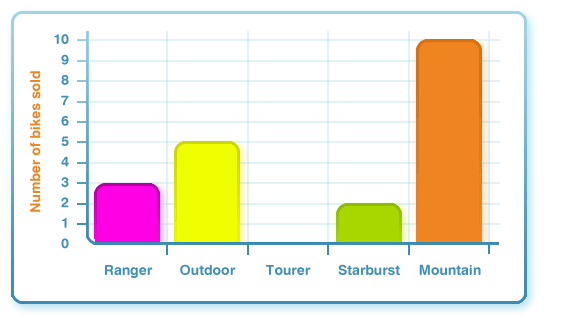
The heights of the bars in this bar chart show how many of each bike were sold.
Pictograms
Pictograms are another way of showing the information from a frequency table.
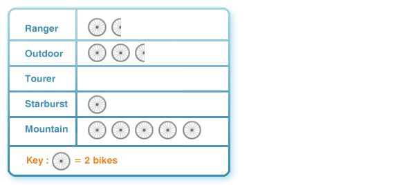
The key shows that 2 bikes are represented by a picture of a wheel. So half a wheel must represent 1 bike.
Pie charts
Pie charts are circles divided into segments, where each segment represents a fraction of the total amount.
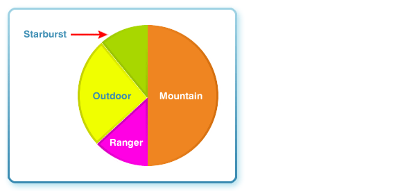
This pie chart shows the 20 bikes sold at the bike shop. The segment for Mountain bikes is one half of the chart. This is because 10 Mountain bikes were sold, which is exactly half the number of bikes sold in total (20 bikes).
Line graph
A line graph is used to plot a set of data over an amount of time. This line graph plots the temperature of a hot drink over an hour. You can see how the drink temperature cools over time:
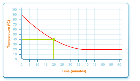
To find the temperature of the drink after 20 minutes:
Always look carefully at the scale on each axis of the graph - each mark represents a different number.
- Find the 20 minutes mark along the bottom axis of the graph.
- With a ruler or your finger, follow the line upwards until you reach the curved graph line.
- Now follow the line to the left until you reach the vertical axis.
- You can now read the temperature of the graph and find out that the drink was 40°C after 20 minutes.
Always look carefully at the scale on each axis of the graph - each mark represents a different number.
